Leveraging CSS3
Mobile web browsers these days are pretty advanced. Android devices use a mobile version of Google Chrome, whilst the iPhone does the same with Apple’s Safari. Some mobile devices come with mobile Opera and others allow you to install a browser of your choice such as mobile Firefox. So we’re talking about some pretty good browsers in terms of CSS3 and HTML5 feature support.CSS3 allows us to render things through code that would previously have required an image. We can use color gradients, draw rounded corners, create drop shadows, apply multiple backgrounds to HTML elements, and more — all of which can help improve performance and decrease development times.
If you look at a typical application interface via your smartphone, it’s almost guaranteed that you’ll find CSS3 being used.
By using CSS3, we can reduce data transfer — particularly images and possibly excess HTML markup. We let the browser and the device do the work to render the interface more quickly.
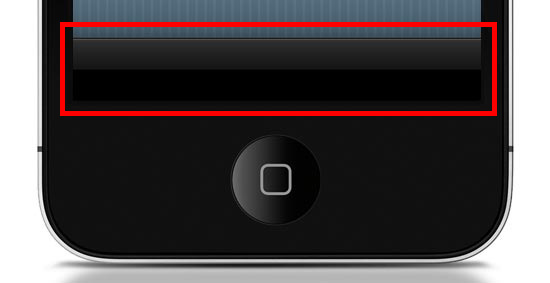
Want the Apple-esque toolbar highlighted above? All you need is the following style rule (which uses CSS3) rather than creating and loading a CSS background image (which is how we’d traditionally do this with CSS2).
.toolbar {
  width: 100%;
  height: 44px;
  background-color: #000000;
  border-top: 1px solid #4B4B4B;
  background-image: -moz-linear-gradient(top, #2F2F2F, #151515 50%, #000000 51%, #000000);
  background-image: -o-linear-gradient(top, #2F2F2F, #151515 50%, #000000 51%, #000000);
  background-image: -WebKit-gradient(linear, 0% 0%, 0% 100%, from(#2F2F2F), color-stop(50%, #151515), color-stop(51%, #000000), to(#000000));
  background-image: linear-gradient(top, #2F2F2F, #151515 50%, #000000 51%, #000000);
}
Here’s what it looks like when applied to a div element viewed in Safari (desktop):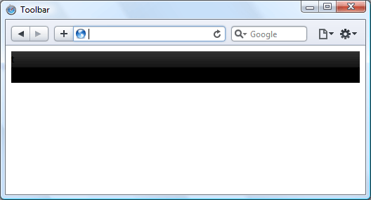
Now, instead of an image that won’t scale well — i.e., if the toolbar’s height needs to be increased, a CSS background image will not scale with it — we have a device-rendered HTML element with a gradient that will scale and adapt nicely for different device orientations and sizes.
It’s true that older browsers such as IE on a Windows Mobile device won’t necessarily render the gradient, but we can circumvent that problem by using the
background-color within the same CSS
rule as a fallback mechanism. This means all browsers capable of the
gradient will show the gradient, but those that can’t will show the
solid color instead (which we set to black, #000000).All users still get to enjoy your mobile web app interface, but older devices just have the extra layer of gloss removed. This technique is called progressive enhancement.
HTML Canvas
If you fancy a little more work, then you can improve speed even further using the canvas element. Although using CSS gradients eradicates the loading of a physical image, that method still causes the device’s rendering engine to construct an image in the browser, which can result in a performance reduction depending on the device and browser.By using the
canvas element and some JavaScript, we can
get the browser to draw the gradient without rendering it like an image.
This technique can possibly be speedier on certain browsers, even if we
need to use JavaScript. At the very least, using canvas is another tool you can use for drawing if it can’t be done in CSS3 or if you find that it’s a better option for performance.To create the same toolbar above, first we need to create a
canvas element in the HTML document like so:<canvas id="toolbar"></canvas>Then, with JavaScript, we can use the following script to produce the desired gradient on the canvas:
var canvas = document.getElementById("toolbar");
var context = canvas.getContext("2d");
var gradient = context.createLinearGradient(0, 0, 0, 44);
gradient.addColorStop(0,'#2F2F2F');
gradient.addColorStop(0.5,'#151515');
gradient.addColorStop(0.51,'#000000');
gradient.addColorStop(1,'#000000');
context.fillStyle = gradient;
context.fillRect(0, 0, 300, 44);
This is what the above code looks like:
Hardware Acceleration
When it comes to mobile web apps, Apple’s mobile devices are a major consideration that we need to be aware of because of the current popularity of the iPhone and iPad. Safari 5 (on all platforms) brings hardware acceleration into the mix. If you’re not familiar with the feature, Apple describes it as follows:"Safari supports hardware acceleration on Mac and PC. With hardware acceleration, Safari can tap into graphics processing units to display computing-intensive graphics and animations, so standards like HTML5 and CSS3 can deliver rich, interactive media smoothly in the browser."Essentially this means that Safari can use extra hardware device capabilities to enhance the rendering of graphics and transitions, which in turn promises faster user interface performance.

Other browsers have added support for hardware acceleration, too — including Firefox 4, Chrome 10 and Opera 11 — so hopefully we’ll see them integrated into their mobile versions soon, providing silky smooth transitions and lightning quick graphics-rendering for all of us.
Be Cautious of CSS3 Rendering Performance
As brilliant as CSS3 is, certain properties can slow down a web page. WebKit-based browsers, for instance, really seem to struggle with shadows in particular, so just be careful that you don’t apply too many of these to elements of your interface until the issue has been resolved.As another example, the
opacity property can also cause
problems with Safari’s hardware-accelerated rendering, so it’s probably
worth avoiding over-use of this.One workaround to the
opacity property performance issue
is the ability to use RGBa value notation to declare CSS color
properties in modern browsers; the significant factor of this being that
the a in RGBa stands for alpha. By declaring
a color using RGB values, then appending one more value, we can have
full control of the transparency of an element without having to use the
opacity CSS property.Instead of:
.myElement {
  background-color: #000000;
  opacity: 0.75;
}
We could use:.myElement {
background-color: rgba(0, 0, 0, 0.75);
}
We can achieve the same results for our HTML element by using RGBa
values, so when you want to add any transparency to HTML elements, make
sure you’re using the most suitable method.Consider the Offline User Experience
Finally, let’s briefly discuss HTML5 offline data storage.
Making use of local data storage means that once our data has been downloaded to the device, we can use a manifest file which allows us to cache certain files locally. What this means is that when users have no connection, we can continue saving data client-side.
Offline storage opens up a lot of opportunities. For instance, we can now try to maintain the user’s experience even when internet connectivity drops rather than having to defend against the issues posed by the possibility of internet interruptions.
We’re not going to be able to allow data downloads from our server when there’s no connection, but at least we can provide the opportunity to store options and user-decisions on the client’s side, which we can then synchronize back to the server once the internet connection is restored.
Conclusion
Hopefully this article has shown you some best practices, tips, and techniques you can use to design and build quick-loading and beautiful user interfaces for your mobile web products. If you were on the fence, I also hope that this encourages you to get started with mobile web app development.Some people might think that mobile web apps are not as sexy as fully-fledged native apps for iOS or Android. However, the biggest advantage of mobile web apps is that we are able to build them to be platform-independent — we can maintain independence from devices and operating systems. We can make web apps without the need for extra developer toolkits and platform-specific SDKs, and thus we can still use our everyday development tools.


.jpg)


0 comments:
Post a Comment