
From a desktop point of view, these products make browsing just about the most pleasurable experience possible. CSS3 transitions, beautifully crafted HTML5 and embellishments mean their users get the highest possible browsing experience (assuming the content being viewed has been crafted with care and consideration).
Their mobile counterparts equally do not disappoint. Fast-loading JavaScript, combined with equally impressive CSS3 and HTML rendering mean that your mobile browser can provide you with as rich an experience as a native app.
Being mobile and Web-based, there are obviously going to be performance concerns. One advantage of native over Web-based mobile apps is that you download much of the interface when you download the app originally, so you are only really loading relevant data when you use them. In addition, native apps can take advantage of the platform’s integrated development features (such as standard UIs), which can further aid performance.
Web-based mobile apps work in the same way as a website would, i.e., you load the content of a page when a user requests to view that page. We can use the browser cache to make things speedier for users with primed caches, but all graphics, images, scripts and data are loaded from your web server as opposed to being on the client’s device (in the case of most native apps).
Mobile Web App vs. Mobile Website
These days, more and more online products come with a mobile version, which is generally a slightly scaled-down version of a main website optimized for small screens (see Amazon, Twitter, and the BBC homepage, for example). A mobile version of a site often takes a site’s content and outputs it so the information can be consumed more easily on a mobile device.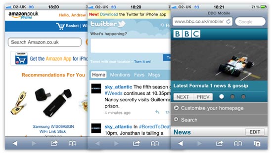
CSS media queries and other feature-detection techniques can be used to determine certain characteristics of a device or browser viewport, which gives developers the option to use the same code to present content at its best for the situation in which it is being viewed.
Mobile web apps are similar in a certain respect, because you want the content to be enjoyed and digested as easily as possible.
I would argue, though, that a mobile web app differs from a mobile version of a website due to it being tailor-made for the mobile platform. The UI will generally be more customized, and will include more mobile-device-centric user interfaces, as can see from the following examples.
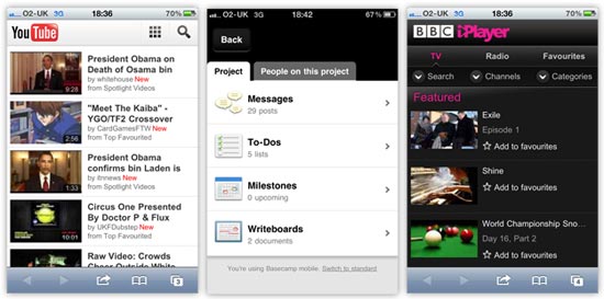
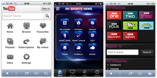
At a quick glance of the mobile web apps above, you can see how the user interfaces are more customized to suit the mobile platform. They use bigger hit areas optimized for fingertips, making them easier to use. The YouTube and iPlayer examples use more grid-based button layouts, presenting controls within the app in a similar way as native mobile apps do.
As an example, shown below, you can see the similarities between the two forms of apps and their UI elements by comparing the YouTube and iPlayer web apps, and the Sky Sports News native app on the iPhone.
Mobile as a Platform
We’ve all got a mobile device these days — whether it’s a smartphone like the iPhone or a touchscreen tablet like the iPad — and most of us in the industry will use many different features of our mobile devices for various purposes.It’s now easier for a greater proportion of people to access the Mobile Web, and that should be an important consideration when you decide to launch a product in this space.
Mobile design and data delivery differs from the traditional desktop environment; let’s talk about that next.
Desktop vs. Mobile
Here’s a quick breakdown of the big differences between desktop and mobile platforms:
- Mobile device hardware is smaller and generally tends to have lower hardware resources than desktops/laptops.
- Smaller screens bring about different design considerations and challenges.
- Touchscreen technology introduces new interaction concepts that differ from traditional input devices (keyboard and mouse).
- With a mobile device, internet connectivity is not always as reliable as a hard-wired broadband connection, which means internet connectivity is a concern and data transfer could be significantly slower.
Touchscreen technology is exciting. The smaller screen design will really make you think about how to get the user to interact with your mobile web app in the most satisfying way possible.
What we should really be doing is looking at the list of differences above and seeing opportunities to deliver our content in a different way.
Building mobile web apps will be a paradigm shift from traditional web development and web design.
Mobile is the platform that people can have with them all of the time. That’s an exciting concept.
In the next sections, we will discuss development/design considerations, as well as concepts and techniques for building mobile web apps.
Keep File Sizes Small
When you don’t have sufficient WiFi coverage, data connection will usually be slower or non-existent. For any mobile product — whether it’s a native app that relies on data transfer, a mobile web app, or a mobile version of a site — concerns regarding internet connectivity means you should try to cut down on the amount of data that your user has to download.Quicker experiences are generally more satisfying and are therefore more usable. We can speed things up by keeping files smaller in size and reducing the number of files we serve to users.
Remember:
- Slower download speeds = longer loading times
- Smaller and fewer files = quicker loading times
Dealing with Image Performance
We want to try to get rid of as many images as we can. For the images we keep, we want them to be as lightweight as possible.If images are a necessity for particular parts of your mobile web app design, then there are a couple of extra steps we can use to trim off any excess fat from your files.
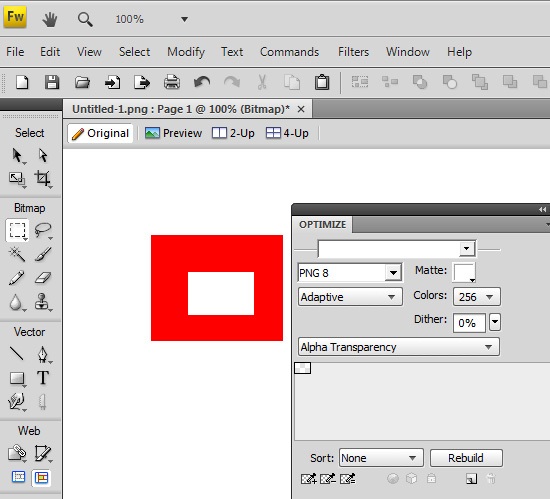
Use Adobe Fireworks for Transparent PNGs
I have to admit that I don’t really use Fireworks that much these days, as Illustrator and Photoshop more than meet my design requirements, but Fireworks does have one powerful ace up its sleeve. If you want to use PNGs with alpha transparency, then unfortunately, Photoshop will only allow you to export 24-bit PNGs (PNG-24), which are heftier than 8-bit PNGs.Using Fireworks, we can save in 8-bit PNG, even when the image requires alpha transparency. In my experience, this can remove 20% or more off the file size with little to no loss in quality.
All you have to do is open up your 24-bit PNG, then, in the PNG compression settings panel in Fireworks, set it to 8-bit with alpha transparency, and then export. Voila, you have much smaller images to use!
Using ImageAlpha
If Fireworks sounds like too much of a bother, check out ImageAlpha. Once installed, all you need to do is drag your images into its main window and then tweak the export settings to remove excess data from the images.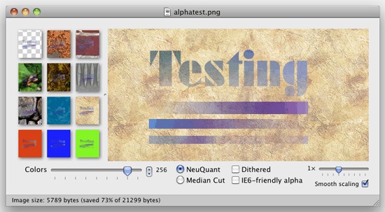
Both techniques are very quick to implement. I would recommend using them for all projects, not just for mobile devices, because they’ll speed up web page loading times for your users due to reduced file sizes.
To learn more about using PNGs in web designs, see the Web Designer’s Guide to PNG Image Format.


.jpg)


1 comments:
You made some decent factors there. I looked on the internet for the difficulty and found most individuals will associate with along with your website.Keep update more excellent posts.
Chatbot Companies
AI Chatbot Development
AI Chatbot
Chatbot Development Company
AI Chatbot Companies
Chatbot Development Companies
Chatbot Development
Chatbot Development Agency
Chatbot Development Services
Chatbot App Development Company
AI Conversational Chatbots
Voice Chatbot
Virtual Assistant Chatbot
Post a Comment